Logotypes
A logo is more than a symbol — it’s the distilled essence of an idea, a story reduced to its purest visual form. Each mark in this collection represents a moment of exploration, where strategy meets intuition and simplicity carries meaning. From bold identities to quiet signatures, these logos were crafted to speak clearly, feel timeless, and leave a lasting impression long after the first glance
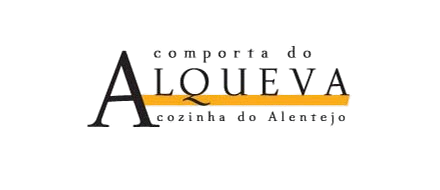
Comporta do Alqueva
Inspired by the quiet grandeur of the Alentejo, this logo blends tradition, warmth, and understated elegance. The elongated A, standing proudly at the centre, evokes the openness of the region’s landscape — wide horizons, slow sunsets, and the timeless calm of Alqueva’s waters. A golden horizontal stroke cuts through the wordmark like a ray of late-afternoon light or the long shadow of an olive tree, hinting at abundance and the richness of local flavours. The supporting typography brings softness and balance, framing the identity with a sense of heritage and sincerity.
Designed for an all-you-can-eat Alentejo restaurant, the mark communicates generosity, authenticity, and the comforting simplicity of regional cuisine — an invitation to sit, share, and savour without hurry.
JB Motos
This logo captures the raw energy and playful confidence of the motorcycling world, blending bold curves with a sense of motion and momentum. The thick, rounded typography gives the mark a street-ready personality — friendly yet powerful — echoing the spirit of riders who live between precision engineering and pure adrenaline. The elliptical underline works like a track or orbit, suggesting speed, grip, and the smooth trajectory of a bike in motion.
Designed for a Yamaha dealer, the identity speaks to accessibility and enthusiasm while maintaining a dynamic edge. It reflects a place where performance meets community — a shop that welcomes newcomers, thrills enthusiasts, and celebrates the culture of two wheels.

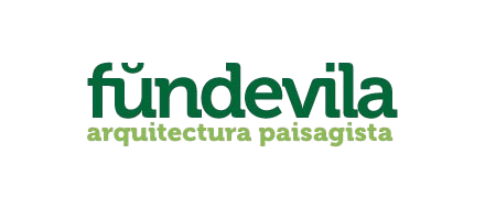
Fundevila Landscape Architecture Studio
This identity embodies the quiet harmony and grounded elegance of landscape architecture. The rounded, contemporary typography conveys a sense of softness and approachability, while the rich green palette anchors the brand in nature, evoking foliage, growth, and ecological balance. The subtle accent above the initial letter adds character and rhythm, like a small organic flourish emerging from the earth. Layers of green in the subtitle mirror the studio’s philosophy: designing spaces where built form and natural systems coexist in fluid conversation.
Crafted for a landscape architecture studio, the logo reflects sensitivity, sustainability, and an attentive respect for the land — a visual promise of spaces shaped with intention, beauty, and environmental harmony.
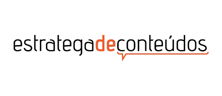
Estratega de Conteúdos
This identity was built around clarity, precision, and the power of well-crafted communication. The minimalist typography reflects a strategic mind at work — focused, structured, and intentional — while the vibrant orange injects energy, signalling creativity and forward momentum. By highlighting “de” and extending it into a subtle speech-bubble underline, the logo visually reinforces the essence of the brand: ideas that spark conversation, stories that guide behaviour, and content that connects audiences with purpose.
Designed for a content writing and web strategy specialist, the mark conveys intelligence, dialogue, and a refined editorial sensibility — a visual promise of messages crafted with clarity, strategy, and impact.
SIC Europa
This identity captures the clarity, authority, and modern rhythm of a program dedicated to Europe’s political and cultural pulse. The bright blue evokes transparency, trust, and the institutional calm of European governance. At the same time, the bold red “EU” places the continent’s identity at the heart of the brand — unmistakable, immediate, and central to the show’s mission. The clean geometric typography reflects the precision of journalism, and the subtle interplay between colours mirrors the constant dialogue, negotiation, and movement that define Brussels.
Created for a TV show covering European subjects from inside the EU’s capital, the logo channels the energy of the newsroom with the credibility of international reporting — a visual signature that feels contemporary, informative, and unmistakably European.
The Teasers
This identity leans into the effortless charm and scrappy charisma of a London indie band that plays for the joy of it rather than the charts. The loose, slightly off-kilter lettering captures that unmistakable DIY spirit — the feeling of gig posters stapled to brick walls, basement rehearsals, and songs written between late-night pints. The teal outline adds a retro-pop wink, giving the logo just enough swagger without taking itself too seriously.
Created for a band that was always more about attitude than fame, the mark embodies the playful, unpolished energy of musicians who know that sometimes the best moments happen far from the spotlight.
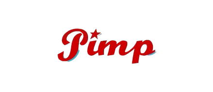
Pimp-snowboards
This logo takes the visual language of modern snowboarding and grounds it in the credibility of a specialist retailer. The confident script and distinctive star mark signal expertise and individuality — the traits that define both the brand and the riders it serves. The angled baseline suggests motion and terrain, bringing subtle references to slope contours and the edges of boards cutting through snow. Designed for an online-only snowboard shop and the official representative of Rome Snowboards in Portugal, this identity positions the brand as authentic, energetic, and deeply connected to the culture it supports.